Starbreeze — Payday 2
Quality-of-life and accessibility UI on a live AAA game, plus the 2D assets — achievement icons and in-game items — that I made and put into the build.
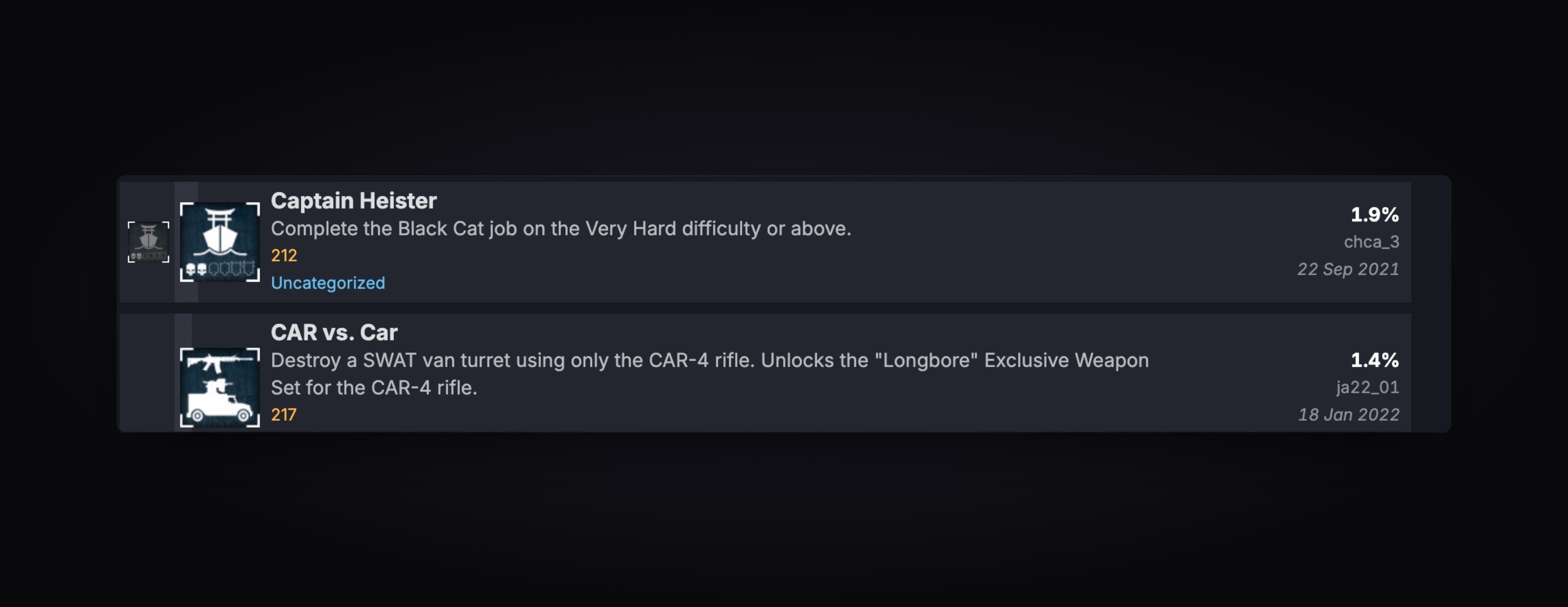
What I can showStudio work. The illustrations below are in the shipped game and dated on SteamDB. Unreleased work stays with Starbreeze.
- Role
- UI/UX Designer
- Team
- Game UI team, Stockholm
- Timeline
- 1 year 2 months
- Platforms
- PC, Console
- Stack
- Photoshop, Illustrator, Figma, In-house game engine
Payday 2 shipped in 2013 and was still in active development when I joined. Players had learned the menus over hundreds of hours, so changes had to work without breaking habits.
My work was quality of life: I played the game to find the friction, then designed menu and interaction improvements against it.
I also worked in the 2D game assets — achievement illustrations and in-game items — in Photoshop and Illustrator, and added them to the build through the studio's in-house engine.
Scope, in my own words.
Played the game to find the problems
Testing Payday 2 as a player rather than reviewing screens, which is how the friction in repetition shows up.
Quality-of-life and menu design
Designed improvements to the menus and everyday interactions, inside a visual language that was eight years old.
Worked in the 2D game assets
Achievement illustrations and in-game items, drawn in Photoshop and Illustrator to match the existing style.
Put them into the build
Added the assets to the game through the studio's in-house engine, where the game runs on Lua, instead of handing them over.
Problem, decision, and why it was the right trade.
Played the DLC before drawing the achievement
- Problem
- An achievement illustration has to say what the player did, at icon size, to someone who has not read the description.
- Decision
- For each one I played the DLC it belonged to, read the achievement description, and built the illustration around the specific action it rewards. Drawn in Illustrator and added straight into the game.
- Why it held
- An illustration made from the description alone tends to show the subject. Playing it first shows the moment.
A fixed point at the centre of the screen
- Problem
- First-person movement makes part of the player base motion sick. They do not report it; they stop playing.
- Decision
- I proposed a fixed dot at the centre of the screen — a stationary reference while the world moves.
- Why it held
- It costs almost nothing to build and it changes who can play. I get motion sickness from first-person games, which is why the problem was visible to me.
Game UI has harder constraints than product work: performance budgets, controller and keyboard parity, and a visual language you cannot renegotiate.
- Accessibility feature proposed
- 1
- Assets made and integrated by me
- 2D
- Live title, active development
- AAA
Remote Work
An Android app that pulls remote jobs from five boards into one list, tracks every application and builds your CV. Past 100,000 installs.