Heroic Games Launcher
I ran the validation research that decided this was worth building. It now has 500k+ monthly users, and I still design and ship its interface.
What I can showOpen source. Every pull request, review conversation and decision below is public on GitHub.
- Role
- Validation research · UX/UI design (2020—) · front-end (2025—)
- Team
- Open-source maintainers and contributors
- Timeline
- 5+ years, ongoing
- Platforms
- Linux, Windows, macOS, Steam Deck
- Stack
- TypeScript, React, SCSS, Electron, Lucide, Figma
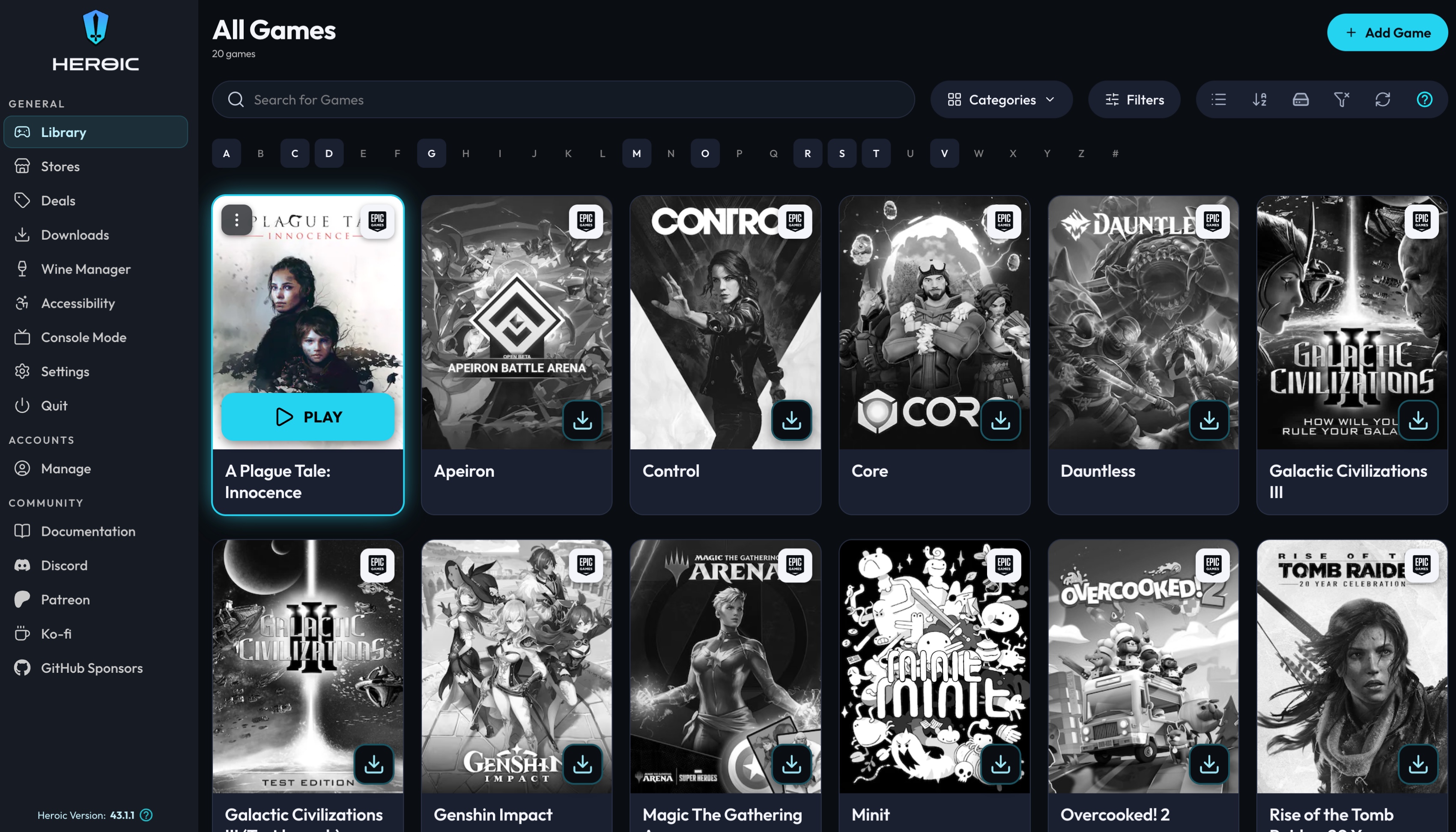
Heroic Games Launcher lets more than 500,000 people a month play GOG, Amazon and Epic games on Linux, Windows, macOS and Steam Deck. It is free and open source.
In 2020 I ran the validation research that came before it: desk research plus interviews with Linux users, to find out whether it was worth building at all.
I have contributed as a UX/UI designer since then, and as a front-end developer since 2025. The interface had grown one contribution at a time — three fonts, Material UI mixed with custom SCSS, and 15 bundled themes that each broke somewhere. Nobody asked for a redesign; I opened one as a series of pull requests.
Give Heroic a coherent interface that any of its 15 themes can wear, without asking maintainers to accept a rewrite.
- 15 bundled themes must keep working
- Every decision reviewed in public
- Incremental pull requests, each shippable on its own
- Three operating systems, one codebase
The findings that moved the design.
Linux users wanted their existing libraries
The 2020 research combined desk research with interviews. The demand was specific: play the games you already own on Linux, without a storefront saying it is unsupported.
The themes were the real constraint
Colours were hardcoded per component, so text legibility depended on which theme the user had picked. Any fix had to be structural.
Layout logic was duplicated
Spacing and panel structure were re-implemented per screen, so the same bug had to be fixed four times.
Problem, decision, and why it was the right trade.
Surface-aware colour tokens
- Problem
- Text colour was set per component, so a theme with a light surface could render low-contrast text. There was no way to check 15 themes by hand.
- Decision
- Replaced hardcoded values with semantic tokens: a component asks for a role on a surface, and the token system resolves the colour.
- Why it held
- One change made text legible across every bundled theme, and made new themes safe to add.
One font, one type scale
- Problem
- Rubik and Cabin were both in use, with ad-hoc sizes per screen. Nothing lined up.
- Decision
- Outfit as the single app font, and a 12/14/16/18/20/24/32/40/48 scale exposed as semantic tokens.
- Why it held
- Contributors pick a role instead of a pixel value.
Shared layout primitives
- Problem
- The game page and settings duplicated layout and spacing across 266 files, so they drifted apart every release.
- Decision
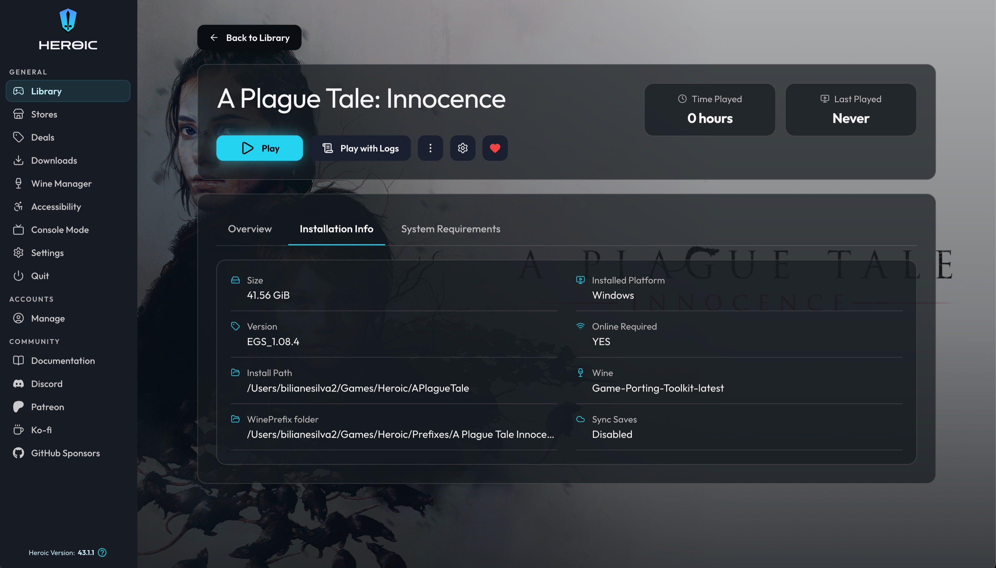
- Introduced Panel, SettingsCard, SettingRow, Alert, Tabs and SpecCard, then rebuilt the game page as a hero with a tabbed panel, and settings as cards.
- Why it held
- Spacing and structure live in one place.
Outlined icon system
- Problem
- MUI icons carried a different visual language and a heavy dependency.
- Decision
- Migrated the library, sidebar, header, search, action icons and filters to Lucide outlined icons.
- Why it held
- One icon weight across the app.
Heroic Theme
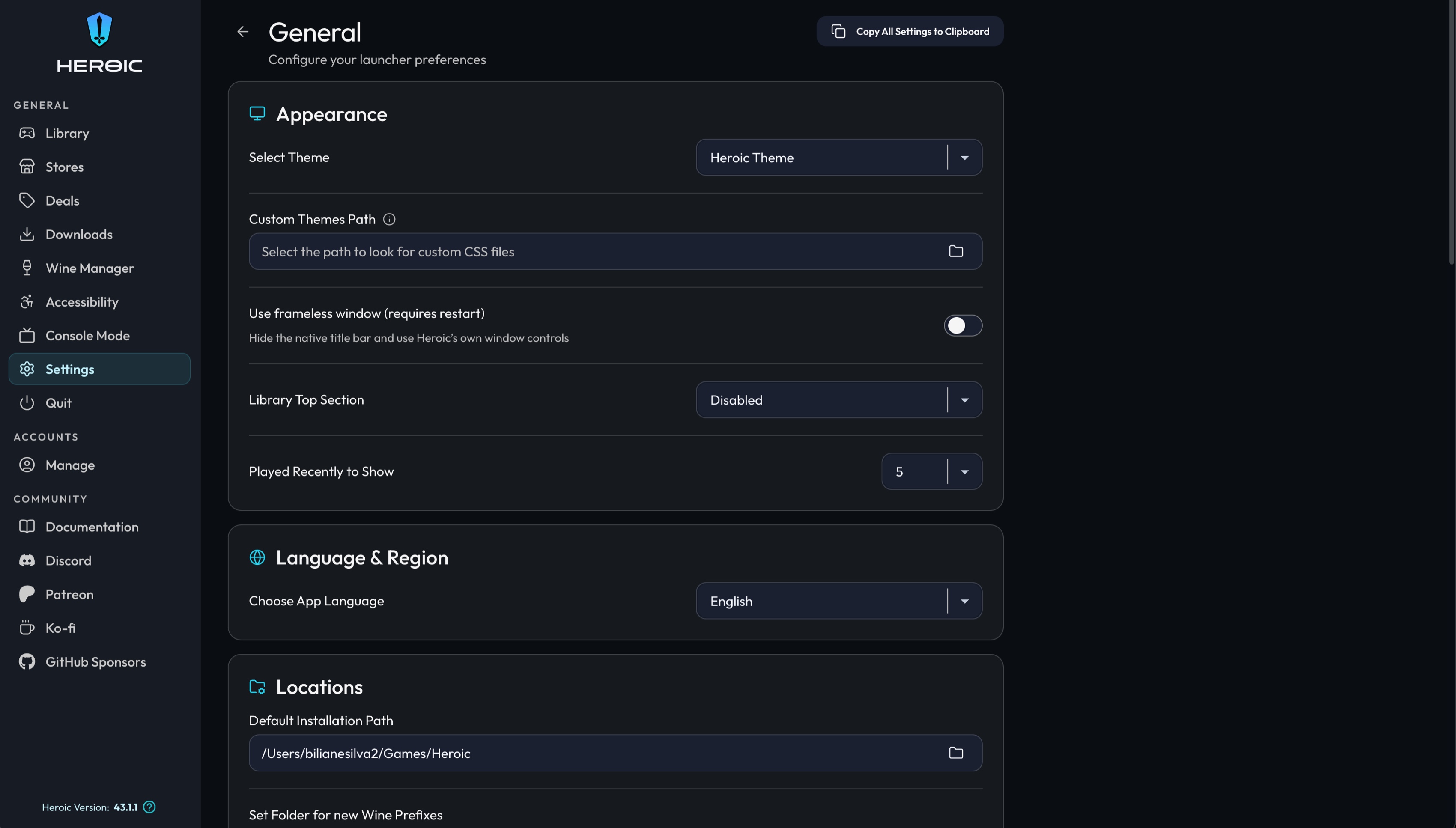
Alongside the structural work I designed a new theme: dark, minimal, cyan accent (#22d3ee). It sits in the theme picker next to the community themes rather than replacing them.
The token layer underneath is what lets the other 15 look deliberate too.
I designed and implemented every change myself, in TypeScript and SCSS, and defended each one in public review. The work arrived as four pull requests, each reviewable on its own.
- Lines of UI code contributed
- ~14k
- Files touched across 4 PRs
- ~500
- Themes kept working
- 15
What changed.
- 500k+
- Monthly users of the product I validated
- 12.5k★
- Stars on the repository
- 5 yrs
- From research to shipping code
The first pull request — tab navigation, theme colours and spacing on the game info page — was merged in March 2025. The library redesign and the game page and settings rebuild are public and in review.
What I would do differently.
I opened the library redesign before the token layer existed, which made the review harder than it needed to be. The structural change should ship first.
Starbreeze — Payday 2
Quality-of-life and accessibility UI on a live AAA game, plus the 2D assets — achievement icons and in-game items — that I made and put into the build.